app.css에 몇가지 규칙을 추가하겠습니다.
.App {
padding:50px;
display: flex;
justify-content: space-around;
flex-wrap: wrap;
font-size:14px;
}
.App--loading{
display: flex;
justify-content: center;
align-content: center;
height: 100%;
}
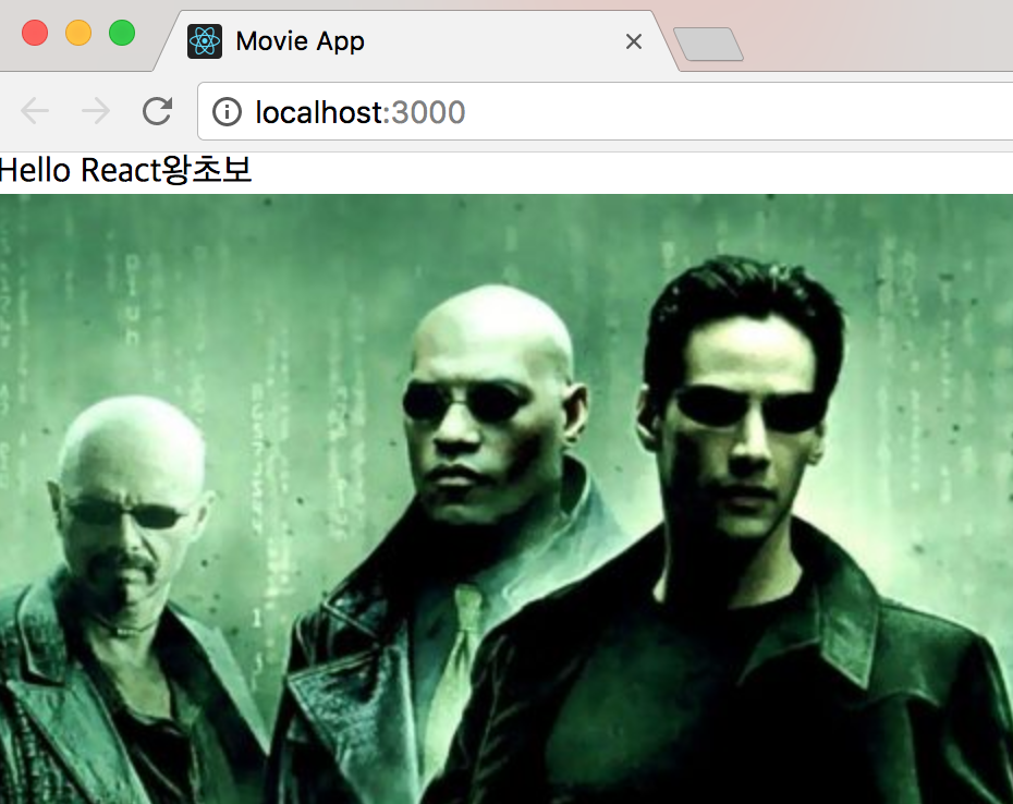
아래는 전 시간까지 작성하였던 app.js 파일입니다.
import React, { Component } from 'react';
import './App.css';
import Movie from './Movie';
class App extends Component {
//Render : componentWillMount() -> render() -> componentDidMount()
//Update : componentWillReceiveProps() -> shouldComponentUpdate() -> componentwillUpdate() -> render() -> componentDidUpdate
state = {};
componentDidMount() {
this._getMoives();
}
_renderMovies = () => {
const movies = this.state.movies.map((movie ) => {
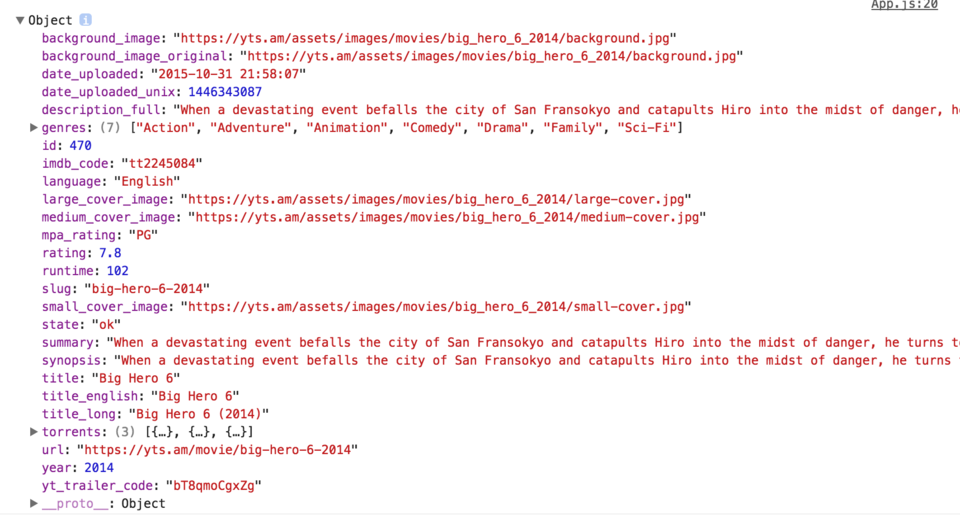
console.log(movie)
return <Movie
title={movie.title_english}
poster={movie.medium_cover_image}
key={movie.id}
genres={movie.genres}
synopsis={movie.synopsis} />;
});
return movies;
};
_getMoives = async () => {
const movies = await this._callApi()
this.setState({
movies
})
}
_callApi = () => {
.then(response => response.json())
.then(json => json.data.movies)
.catch(err => console.log(err));
};
render() {
return (
<div className="App">
{this.state.movies ? this._renderMovies() : "Loading"}
</div>
);
}
}
export default App;
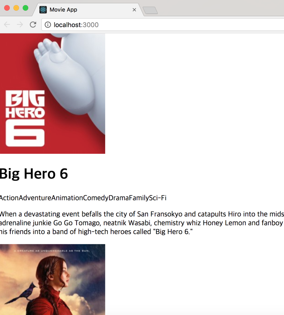
아래와 같이 일부 수정을 해주었습니다.
여기서 수정한 것은 app 컴포넌트의 클래스 이름입니다.
render() {
const { movies } = this.state;
return (
<div className={movies ? "App" : "App-loading"}>
{movies ? this._renderMovies() : "Loading"}
</div>
);
}
}
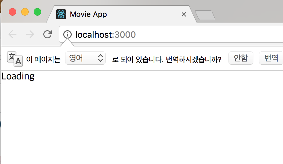
state에 movies 가 있는지 물어봅니다.
movies가 있으면 div의 이름은 app , movies가 없으면 app-loading이라고 정했습니다.
movie.js 파일도 아래와 같이 수정 하였습니다.
import React from "react";
import PropTypes from "prop-types";
import LinesEllipsis from "react-lines-ellipsis";
import "./Movie.css";
function Movie({ title, poster, genres, synopsis }) {
return (
<div className="Movie">
<div className="Movie__Column">
<MoviePoster poster={poster} alt={title} />
</div>
<div className="Movie__Column">
<h1>{title}</h1>
<div className="Movie__Genres">
{genres.map((genre, index) => (
<MovieGenre genre={genre} key={index} />
))}
</div>
<div className="Movie__Synopsis">
<LinesEllipsis
text={synopsis}
maxLine="3"
ellipsis="..."
trimRight
basedOn="letters"
/>
</div>
</div>
</div>
);
}
function MoviePoster({ poster, alt }) {
return <img src={poster} alt={alt} title={alt} className="Movie__Poster" />;
}
function MovieGenre({ genre }) {
return <span className="Movie__Genre">{genre}</span>;
}
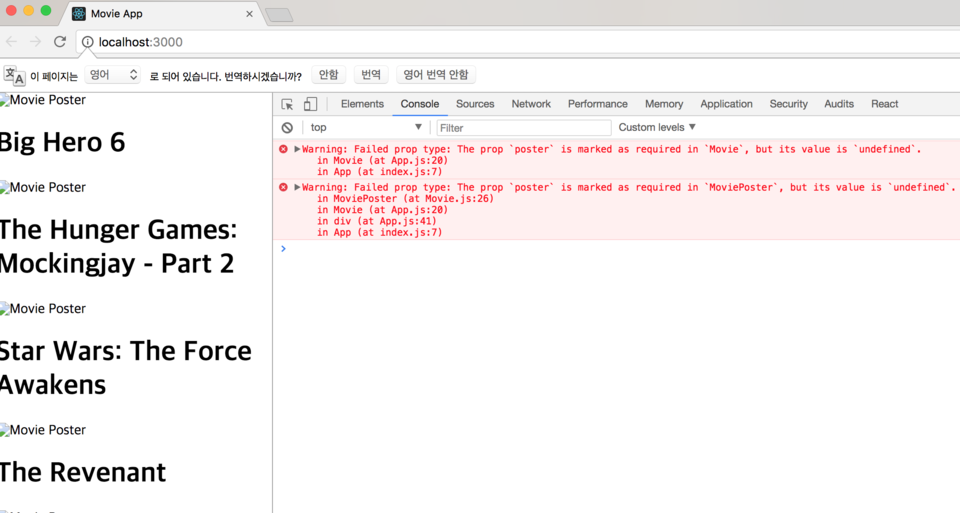
Movie.propTypes = {
title: PropTypes.string.isRequired,
poster: PropTypes.string.isRequired,
genres: PropTypes.array.isRequired,
synopsis: PropTypes.string.isRequired
};
MoviePoster.propTypes = {
poster: PropTypes.string.isRequired,
alt: PropTypes.string.isRequired
};
MovieGenre.propTypes = {
genre: PropTypes.string.isRequired
};
export default Movie;
그리고 index.css도 수정하였습니다.
body {
margin: 0;
padding: 0;
font-family: -apple-system, BlinkMacSystemFont, 'Segoe UI', Roboto, Oxygen, Ubuntu, Cantarell, 'Open Sans', 'Helvetica Neue', sans-serif;
background-color: #EFF3F7;
height: 100%;
}
html, #root{
height: 100%;
}
폰트, 배경색, 높이를 정해줬습니다.
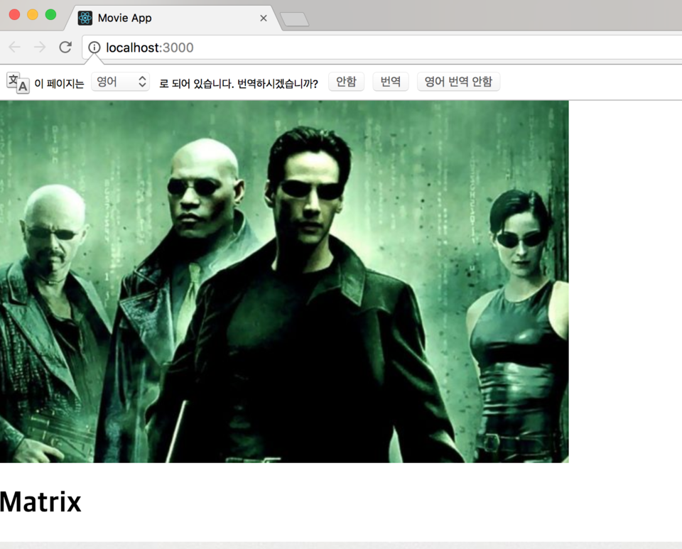
movie.css 도 아래와 같이 수정해주었습니다.
배경색, 박스쉐도우, 마진, 플렉스, 그리고 movie column도 조정했습니다.
그리고 영화제목 css, 장르, 시놉시스, 포스터에 쉐도우도 넣었습니다.
.Movie{
background-color:white;
width:40%;
display: flex;
justify-content: space-between;
align-items:flex-start;
flex-wrap: wrap;
margin-bottom: 50px;
text-overflow: ellipsis;
padding:0 20px;
box-shadow: 0 8px 38px rgba(133,133,133,0.3),0 5px 12px rgba(133,133,133,0.22);
}
.Movie__Column{
width: 30%;
box-sizing: border-box;
text-overflow: ellipsis;
}
.Movie__Column:last-child{
padding: 20px 0;
width:60%;
}
.Movie h1{
font-size:20px;
font-weight: 600;
}
.Movie .Movie__Genres{
display: flex;
flex-wrap: wrap;
margin-bottom: 20px;
}
.Movie__Genres .Movie__Genre{
margin-right: 10px;
color: #B4B5BD;
}
.Movie .Movie__Synopsis{
text-overflow: ellipsis;
color: #B4B5BD;
overflow: hidden;
}
.Movie .Movie__Poster{
max-width: 100%;
position: relative;
top:-20px;
box-shadow: -10px 19px 38px rgba(83, 83, 83, 0.3), 10px 15px 12px rgba(80, 80, 80, 0.22);
}
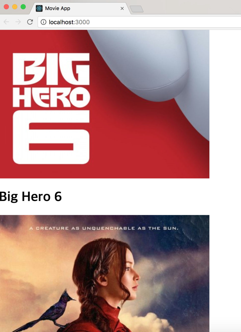
아래와 같이 responsive 작업도 해주었습니다.
@media screen and (min-width:320px) and (max-width:667px){
.Movie{
width:100%;
}
}
@media screen and (min-width: 320px) and (max-width: 667px) and (orientation: portrait){
.Movie{
width:100%;
flex-direction: column;
}
.Movie__Poster{
top:0;
left:0;
width:100%;
}
.Movie__Column{
width:100%!important;
}
}
위에는 모바일 폰, 아래는 모바일-portrait 모드로 작업을 하였습니다.
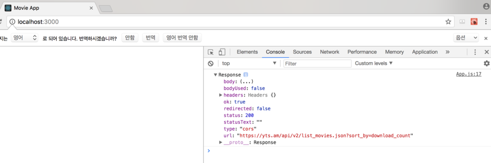
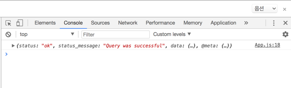
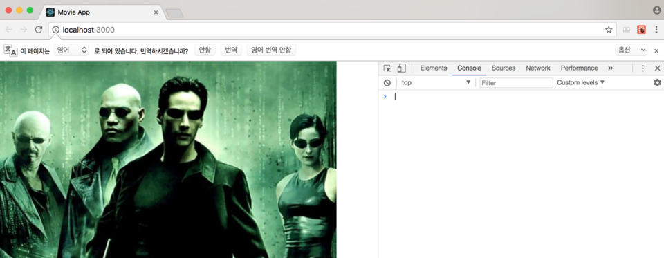
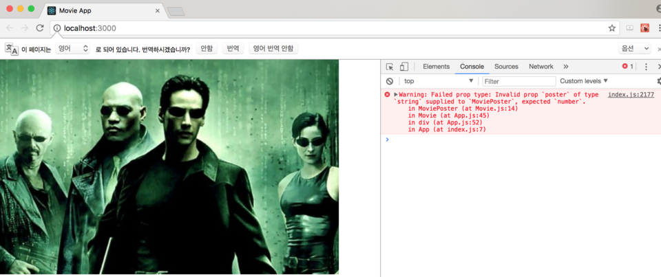
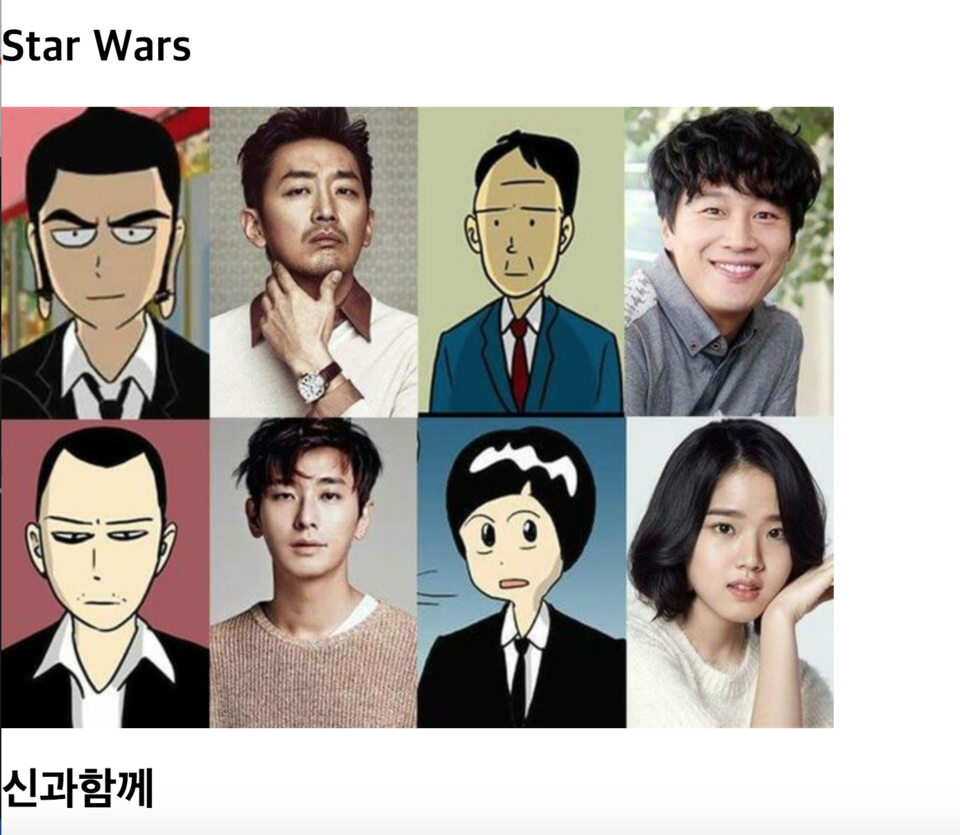
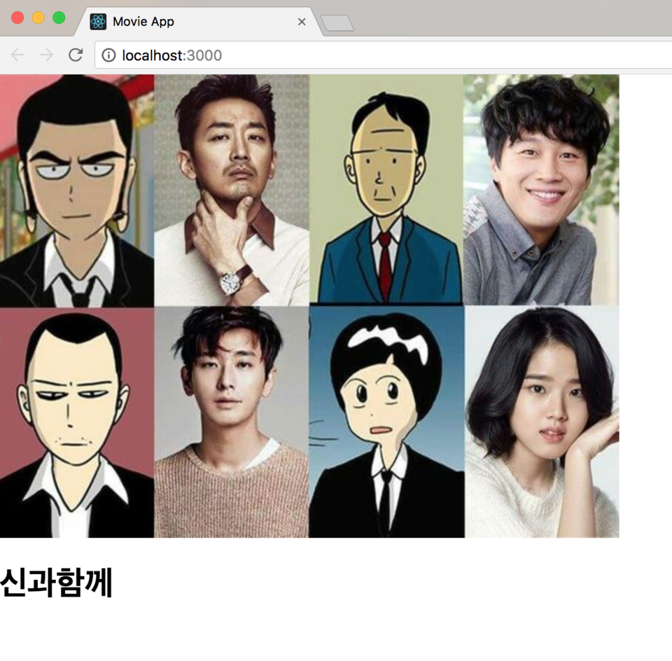
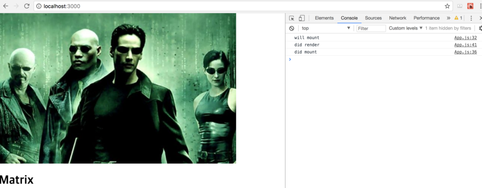
이렇게 코딩을 모두 완료하였고 화면을 확인해보겠습니다.
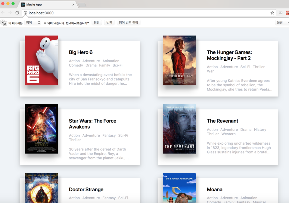
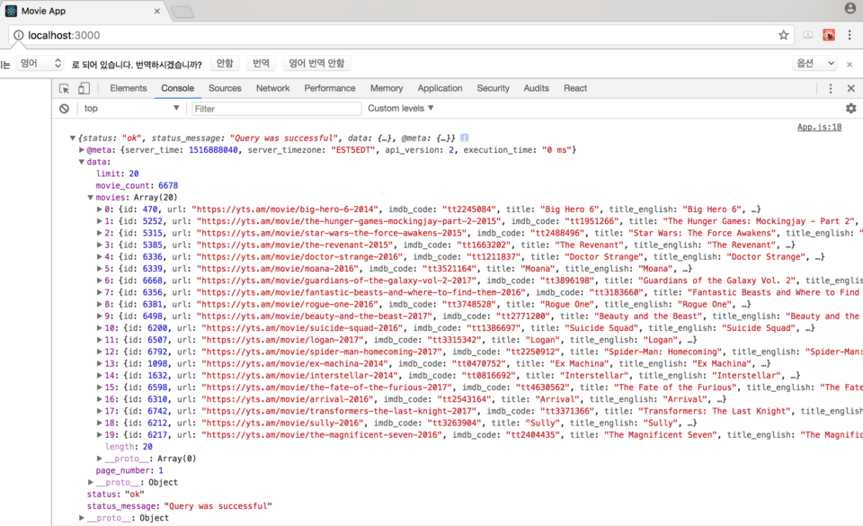
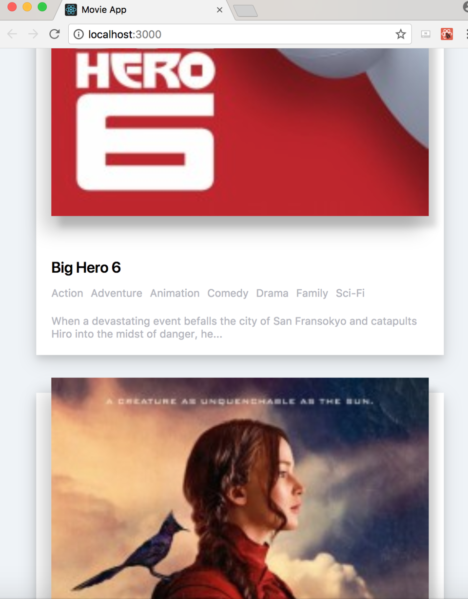
화면을 줄이면 자동으로 보여지는 화면도 수정되는 것을 아래와 같이 확인할 수 있습니다.
이번시간까지 해서 총 20번의 연재를 마쳤습니다. 높은 품질의 결과물은 아니였어도 강의를 따라하면서
끝까지 결과물을 완성할 수 있다는 것에 의미를 두고 싶습니다.
부족하였지만 여러분들에게도 조금이나마 도움이 되는 글들이였기를 바랍니다.
고맙습니다.
'React > 왕초보 도전' 카테고리의 다른 글
| 19. 간단한 영화 웹 서비스 만들기 14 (0) | 2018.01.30 |
|---|---|
| 18. 간단한 영화 웹 서비스 만들기 13 (0) | 2018.01.30 |
| 17. 간단한 영화 웹 서비스 만들기 12 (0) | 2018.01.25 |
| 16. 간단한 영화 웹 서비스 만들기 11 (0) | 2018.01.23 |
| 15. 간단한 영화 웹 서비스 만들기 10 (0) | 2018.01.19 |